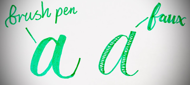
HEYYYY its me!!! Today we will talk about Faux lettering!!(FAKE lettering)Faux, or also known as fake calligraphy is a technique of imitating the look of calligraphy by using any kind of writing tool.
Lets get right into the tutorial!
Faux calligraphy is simply a fun and easy way of imitating the look of these specific tools like brush pens.
The best part,
Is that you can use any writing tool that you have!
Whether it’s a pencil, marker, fineliner, pen, chalk – you can use it to create faux calligraphy.
Faux calligraphy is also a great technique if you want to emulate the calligraphic look on surfaces where you can’t really use regular calligraphy tools.
Surfaces such as –
Chalkboards
Walls
Wood
Clothing
Glass
Etc.
On top of that, faux calligraphy is a great way for beginners to learn about the basic letter structure and the way they interact with each other.
The 3 core rules for faux calligraphy
Before we jump right into the writing part, I feel it’s essential to cover a couple of fundamental rules – especially if you are just getting started.
The better you understand the basics, the easier it will be for you to learn, improve, and gradually expand your skills.
Remember – Your house is only as strong as It’s foundation!
To keep things simple, I will just mention 3 core rules that you should keep in mind when practicing faux calligraphy –
-Basic strokes.
-Consistency.
-Where to add the thick downstrokes – leaving enough space
1. Basic strokes
Writing calligraphy (at least this particular style) is a combination of upstrokes and downstroke motions.
The most important thing to always remember is –
Upstrokes are thin
Downstrokes are thick ect.
you know the rest from lesson 1
( I will ask you this so be prepared!)
and just a little explaining (heh....)
The best way to learn and practice calligraphy is by using the basic strokes.
There are 8 basic strokes that you can use to combine and form nearly every letter of the lowercase (minuscule) alphabet.
By using these basic strokes, we can achieve a much cleaner and more consistent look in our calligraphy.
Here you can see an example of the basic strokes, and how to combine them in order to achieve different letterforms.
the first is a consistant letterform
the second is a inconsistant letterform.


Comments
Post a Comment